

Design System
Component Libraries
Figma
Shipped

Project Type
Design System
My Role
UX Designer
Team
2 Designers, 1 Product Manager, 1 Developer
Duration
2 Weeks
TL;DR
An atomic design system using Figma component libraries
I designed an atomic design system for Ylopo’s product suite, with Mission Control as the primary focus. I established foundational design tokens for color, typography, icons, and visual styles, then built a scalable Figma component library using nested tokens, variants, and reusable patterns. I also documented component specifications and usage guidelines to support consistent implementation and more efficient developer handoff. The library remained a living system, evolving alongside the product as new requirements emerged.

CONTEXT
Inconsistent UI and unclear visual hierarchy across existing products, compounded by the lack of a unified design system to guide teams.
Ylopo’s product ecosystem consists of several products designed to help real estate agents identify, nurture, and convert leads. I joined the team to redesign Mission Control, a product that sits at the center of these workflows. As I audited the platform, I found inconsistencies across the UI, unclear visual hierarchy, and irregular interaction patterns. These issues pointed to a larger gap: there was no unified design system to establish shared patterns and guidelines across the product ecosystem.

PROBLEM
Inconsistent UI and interaction patterns stem from the lack of a unified design system.
While these problems might seem cosmetic, they had greater implications.
For users, this means
Poor Usability
Tasks become harder and less intuitive
Low confidence
The product feels unpredictable.
For business, this means
Slower scale
New products take longer to build.
Lower quality
Experiences feel fragmented and inconsistent.
For developers, this mean
Wasted Effort
As same work is executed again and again differently
Higher maintenance
One-off solutions create more work.
SOLUTION
An atomic design system using Figma
To address the issues identified, I developed an atomic design system. This modular approach allowed me to intentionally design every token, pattern, and component within the system. As a result, the system ensures consistency and efficient reuse while remaining highly scalable, enabling the seamless addition of new patterns and components over time.

All tokens, components and patterns created were designed using Figma's Variants and Components. Since the team works on Figma primarily, this made implementation of the design system simpler. Other documentation was produced for the team too.
DEFINING TOKENS
Defining colors, type, icons, etc
The design team and I began by defining core design tokens such as color, typography, iconography, shadows, and border radius, using Ylopo’s brand guidelines as a foundation.
Colors
I used the brand green as the primary color and paired it with a structured grayscale for balance. The palette included varying contrast levels to support accessible color pairings, while secondary colors were introduced systematically to communicate status and other UI states.
Typography
I selected a clean, modern, license-free typeface that offered enough font weights and styles to support readability and hierarchy. I then defined a range of text styles across sizes and weights to create consistent hierarchy across different interface contexts.

Iconography
We incorporated open-source icon libraries, including Lucide and Carbon, to maintain consistency while reducing the need to create custom icons from scratch.
VARIABLES
Building variable components for each state
After defining the design tokens and publishing them to Figma libraries, the team and I began building the foundational components used across the portal. We designed input fields, status pills and tags, buttons, and tabs, creating multiple variants and states for each to ensure consistency and flexibility across use cases.
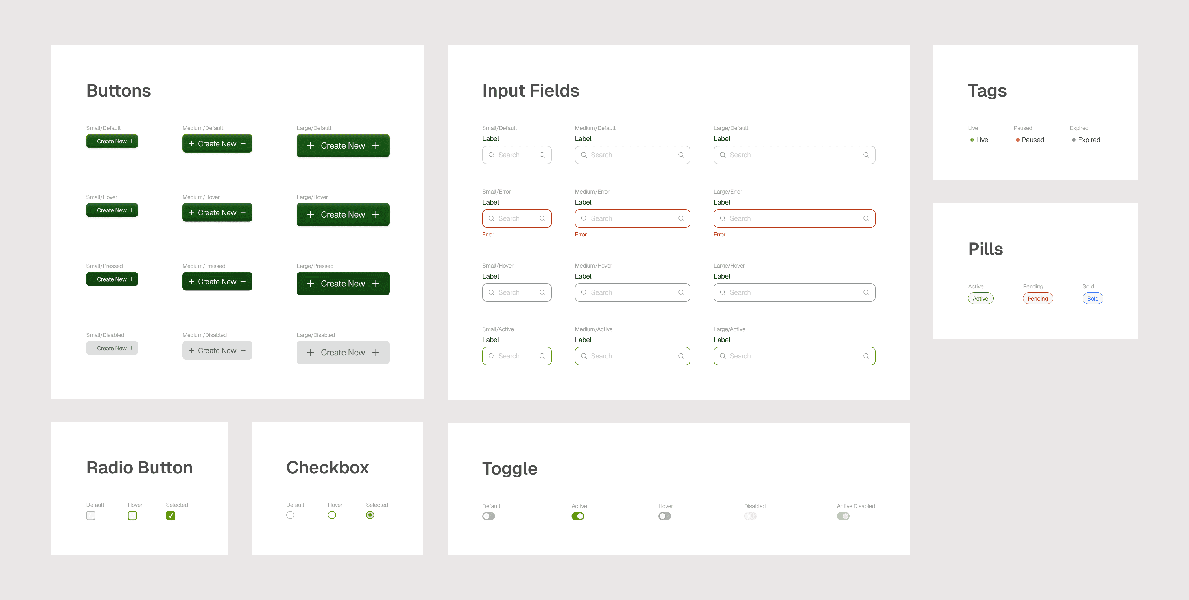
Using Figma components and variants, we created customizable components for every use case, ensuring consistency and smooth scalability across the system.
DESIGNING TABLES
Designing configurable table components
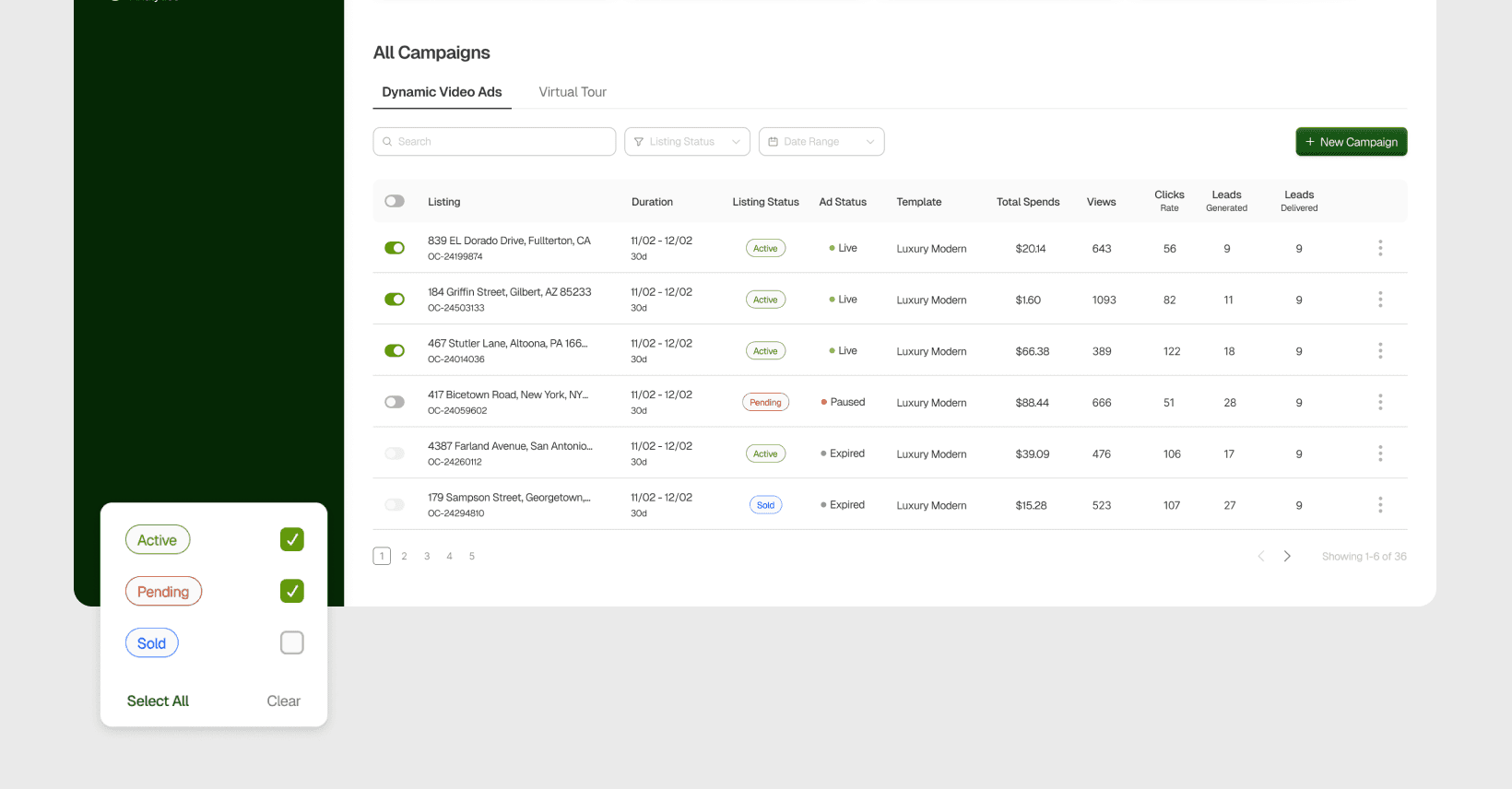
Since tables were central to Mission Control, I built each table column as a configurable component with multiple content types. Elements like pills and tags were also defined as variables, allowing the design team to swap content through Figma properties instead of making manual updates.

HOW IT WAS USED
Stacking and Nesting Multiple Elements to build screens and flows
We built the Mission Control redesign and design system in parallel, stacking and nesting smaller elements to create larger, reusable components. This approach helped us identify recurring patterns across different contexts, reduce duplication, and create components that could scale as the product grew. The design system remained a living system, evolving alongside the platform as new patterns and requirements emerged.
IMPACT
A design system built for speed and consistency
As we redesigned Mission Control, implementing the design system as Figma libraries helped us expedite the design process by reusing predefined, well-documented components. This ensured visual and functional cohesion across all designs. Since Mission Control was part of a broader ecosystem, developers were also able to replicate the system across existing products, enabling an instant and consistent rebrand.
The system also ensured consistency in interactions, making the tools more intuitive and improving overall usability.
View More Projects
Redesigning an ad generation platform to streamline campaign creation, management, and improve product ROI.
for Ylopo, an AI-driven digital marketing platform for real estate agents
Designing conversational onboarding to improve adoption rates and reduce turnaround time
for a Wealth Management Enterprise, New York