for a regulatory authority in Ontario, CA
Interaction Design
Workflow Optimization
Shipped

Project Type
A customer portal for a regulatory enterprise
My Role
UX Designer
Team
1 Designers, 1 BA, 1 PM, 1 Developer
Duration
3 Months
TL;DR
Simplifying service request application by translating manual processes into web applications
I helped a regulatory authority in Ontario move its customer request process from largely manual, form-based workflows to a new digital portal. I redesigned dozens of existing request forms into a small set of smart, reusable workflows, simplifying the underlying processes and using conditional fields to show customers only what was relevant to their request. I also designed for edge cases, validation, and errors to make complex submissions easier to complete accurately.


Impact
Faster task completion
Fewer submission errors
decrease in turnover time
THE CONTEXT
A safety authority functioning through paper
This organization regulates the use of heavy devices in Ontario. It oversees six programs, including boilers, pressure vessels, amusement rides, and more, that manages regulations of their respective device class.
Filing a service request relied on fragmented. manual and outdated processes.
Applicants filled out printed forms, attached documents by hand, and mailed or emailed them to the department responsible for that program. Requests entered an invisible queue, where staff manually reviewed submissions and emailed back and forth to chase missing details. Applicants had no live status or single place to track their requests, relying instead on the last email someone happened to send.

THE PROBLEM
Manual processes that hurt the business and its users
For Customers
No real-time visibility
Risk of non-compliance
Delay in request confirmation
For the organization
High service response time
High error rates in data entry
High operational cost per request
THE SOLUTION
Designing a user layer on a system that already existed
Voila: A web application section for filing service requests, built within the organization’s new customer portal that made it easier for customers to understand and manage their relationship with the organization.
I approached the redesign by asking how the experience could do more of the work for the customer: reducing unnecessary input, structuring requests around what customers were trying to accomplish, and replacing open-ended fields with guided choices wherever possible. These principles shaped how I designed the workflows that followed.
The Approach
Use Case First
Diverging from program based process to a user-centered use case first approach
Automating Input
Use the data we already have. Only ask people for what the system genuinely doesn't know.
Selecting rather then typing
Having data already meant letting users choose and auto populate details rather than enter all details
THE SCOPE
172 forms & we couldn't redesign them all.
The organization had 172 forms on its website, far too many to digitize within the timeline. The first real decision was not about design at all; it was determining which forms actually mattered.
12,542 Forms
Submitted between Dec 2021 - Dec 2022
89% Submissions
were covered by 23 Forms
10 Use Cases
amongst those 23 forms
With the scope reduced to 10 use cases, I designed around user tasks instead of programs, combining multiple forms into one web app that works across all 6 programs and both user groups.
EXHIBIT A: USE CASE FIRST APPROACH
Merging six applications to request an exam into one
The Gist
Individuals become certified by passing an organization-administered exam. The six programs that overlook six distinct equipment types had its own exam form and rules. I merged them into a single form that quietly reshapes itself based on the user’s selection.
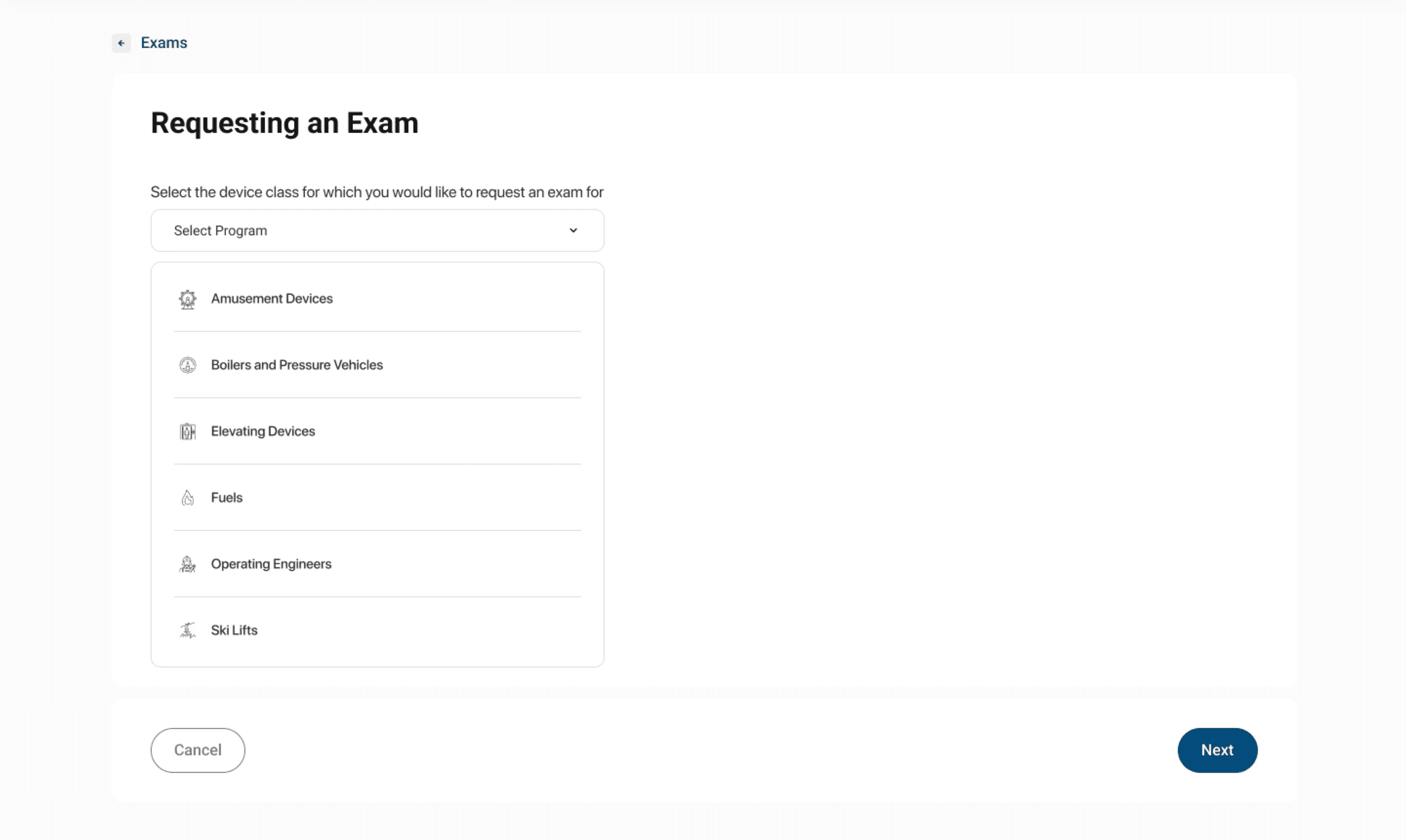
To work on regulated equipment, users have to pass an organization-administered exam. But the exam is not one thing: each equipment type has its own rules for retakes, waiting periods, and required training. Six rulebooks would normally mean six separate forms, but that is not the use-case-first approach we wanted to adopt. Instead, I built one form that adapts as users choose their program.
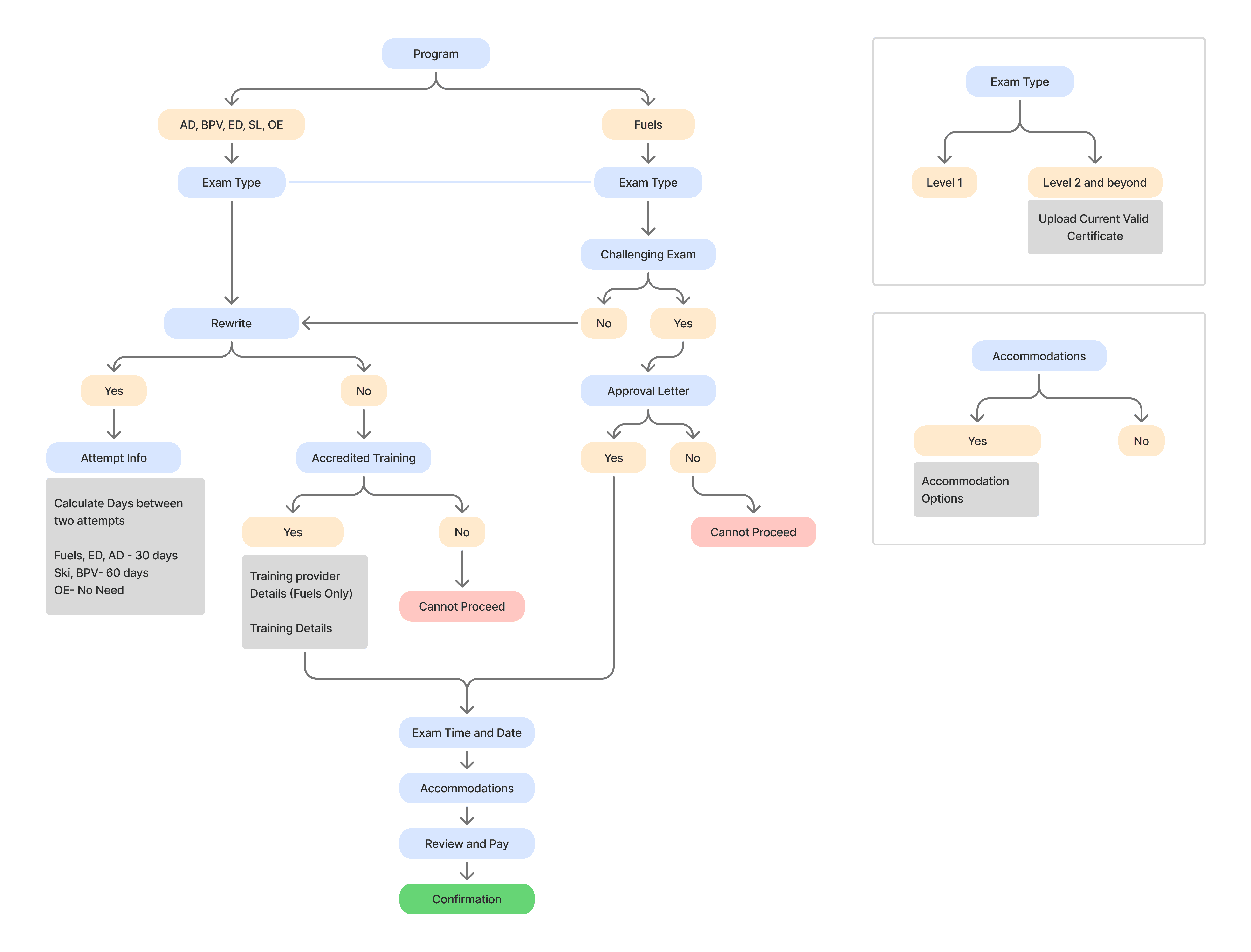
Using progressive disclosure, I ensured that only relevant fields are revealed as users make selections throughout the journey. This helped reduce cognitive load, minimize form complexity, and guide users step-by-step through the experience.
EXHIBIT B: AUTOMATING INPUT
Designing the installation inspection form to reduce errors and completion time
The Gist
When an equipment owner requests a safety inspection, the old form made them hand-write details the organization already had on file. I redesigned it so the form fills those in and the owner simply picks and confirms.
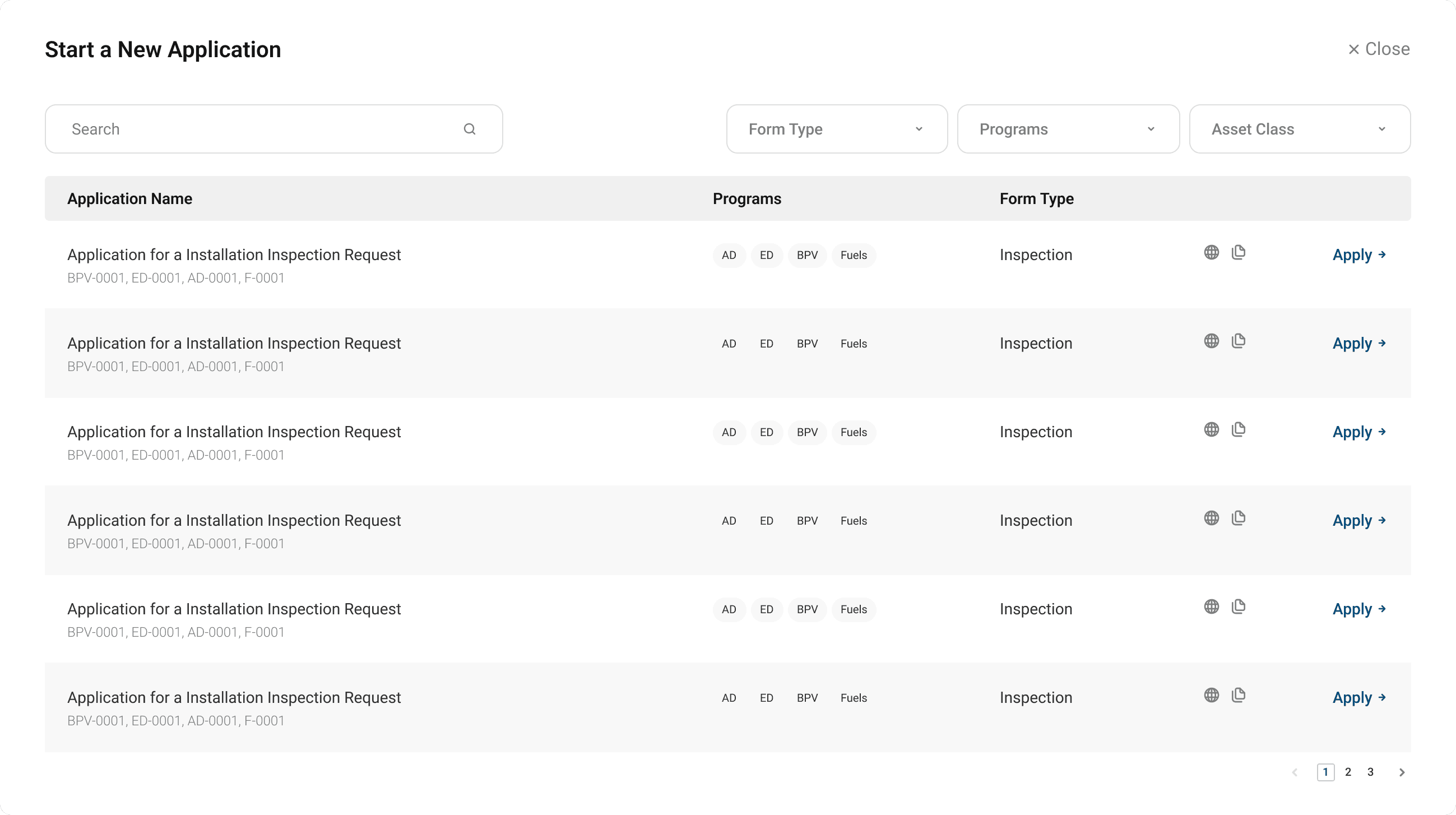
The Application for a BPV Installation Inspection
Note: An Application for an Installation Inspection exists only for boilers and pressure vehicles, hence there is no unification process in this case.
The original BPV Inspection Request form looked like this. A dense form with lot of details to input.
What the original form structure looked like
The old paper form required users to write out the device ID, site address, and owner details by hand every time, even though the organization already stored this information against their account.
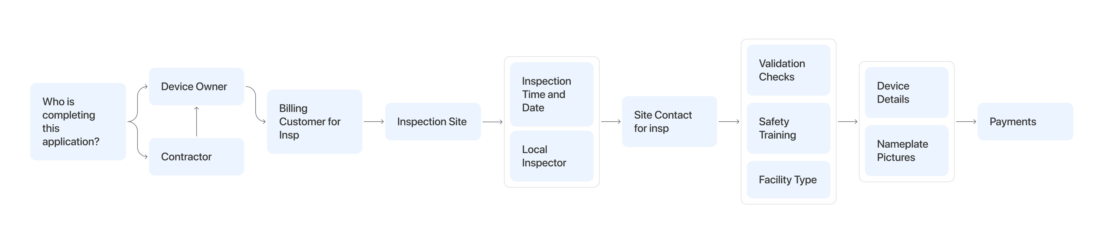
The optimized form filling process
The new form-filling experience uses profile and associated inventory data to auto-fill key details, reducing redundancy and streamlining the process.
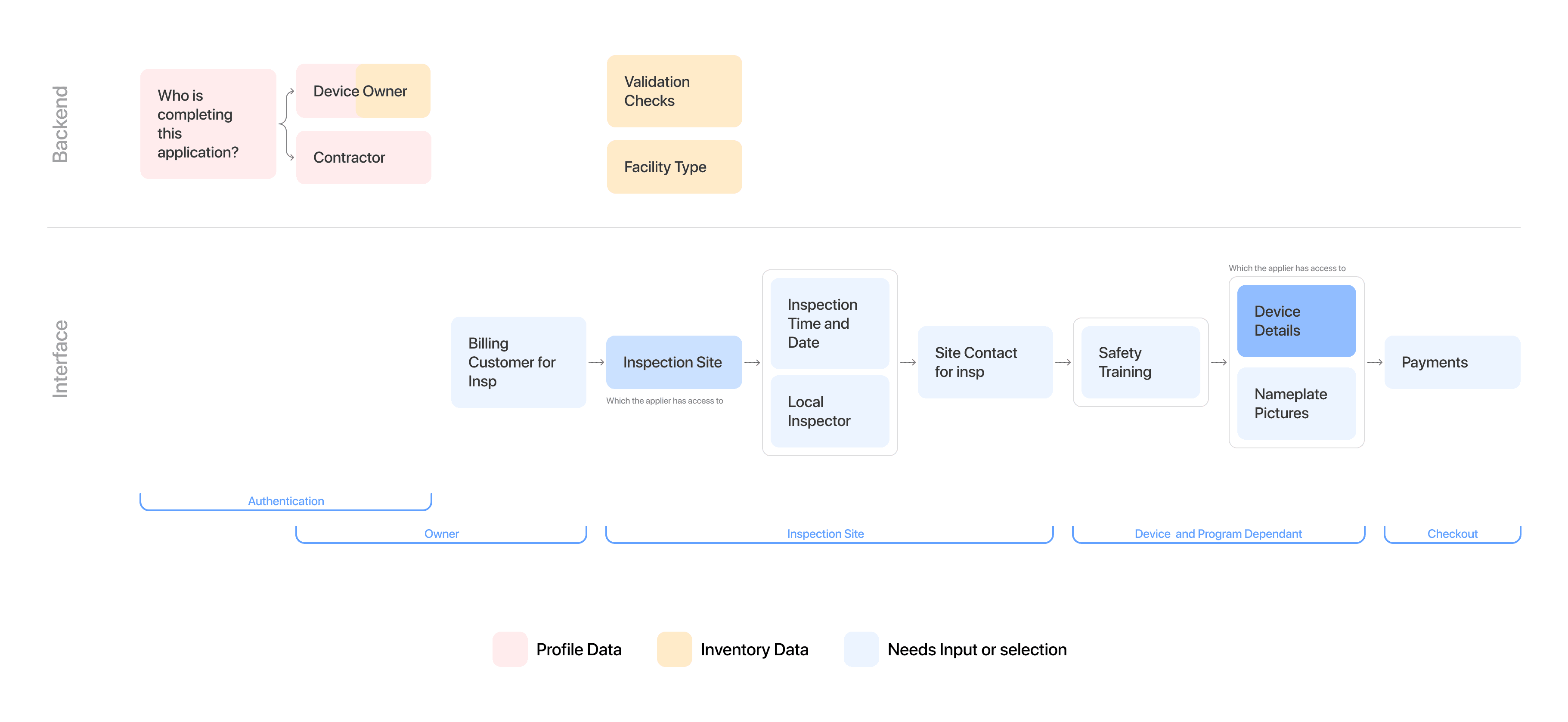
The flexibility of paper forms came from allowing anyone with the right information to complete the process. Autofill improved convenience, but it also created significant security risks.
EXHIBIT C: SELECTION OVER TEXT ENTRY
Interaction patterns to avoid manual mishaps
Using selection first interaction patterns to avoid manual entry errors
Having structured data available for selection reduces typing errors and minimizes data discrepancies, leading to more accurate and consistent inputs across the system. It also makes the process of filling easier.
Auto-populating contact details to ensure accurate data entry and avoid duplication of records
Selecting inventory over entering inventory number manually.
OUTCOME
Faster application filing with less efforts and errors
The applications launched in production, and the results mapped straight back to the problems on both sides: customers file faster and with fewer mistakes, and staff spend far less time pushing paper.
Impact
Faster task completion
What took 30 minutes now took 20 minutes (including supporting doc gathering)
Fewer submission errors
Internal teams reported 12% reduction in follow ups surrounding application material verification
decrease in application turnover time
Organization teams were able to verify and review applications faster by skipping manual re-entry into internal systems.
What I learned from this
The sharpest decisions here weren't about how things looked. They were about what to do for the user automatically, what to keep visible, and who should be allowed to do what. I used real data to find the direction, simplified the workflows, and chose patterns that made the right thing the easy thing.
View More Projects
Designing conversational onboarding to improve adoption rates and reduce turnaround time
for a Wealth Management Enterprise, New York
Designing an AI-powered dashboard that turns financial data into actionable insights
for a large Commercial and Investment Bank